The 11 things your practice page actually needs
Most practice websites are trying to do too much. Strip a page back to what actually earns a booking and you're left with 11 pieces. Not sections in a bigger page — the whole page.
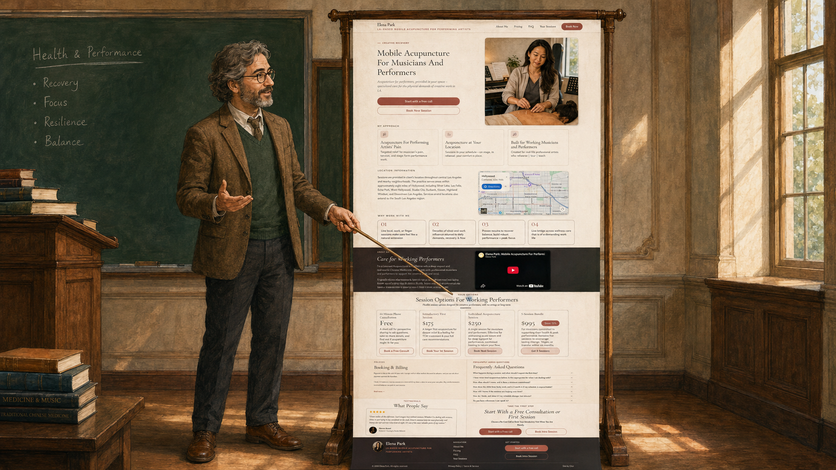
Practice website corrected · MD Most practice websites are doing too much.
There's an About Me page. A Menu of Services page. There's a Blog. Mega Menus. Fancy parallax animations. And more.
And all the visitor wants is to get some damn help.
From such websites, they usually don't.
The dragging and dropping was not the problem. It looks fine. It just doesn't move a stranger from maybe to booked.
A person landing on a practitioner's page is asking two things. Do I trust this person? And can I actually afford it?
Everything on the page is either helping them answer those essential questions or getting in the way.
The way through is a page built out of the pieces that carry the decision, and nothing else. There are 11 pieces that need to be baked into a winning web page.
The first five second rule
Picture someone who's been dealing with a problem for months. They googled it tonight after the kids went down.
A page that works lets the right person recognize themselves fast, like in five seconds or less. Then it walks with them in a straight line from this might be for me to how do I book.
In the following list I will speak in broad strokes. I'm not specifying the order and level of detail that you need in your situation. This is not the recipe, but more of the ingredients list.
These 11 pieces are on that list.
1. Who you help
Every practitioner helps individuals. These people have stories; they are going through life in ways that are meaningful to them. When we identify who we help, we are defining a human being as succinctly as possible. Not generic "adults." Not "middle aged women in transition."
We need a sentence a stranger can read and say: Yeah, that's me.
I help postpartum moms dealing with exhaustion and stress.
That sentence acts like a filter. Anyone who is the right fit for you knows it immediately. Everyone else clicks off. That's ok.
2. How you help
Most people don't know the nuance of every modality out there. They are looking for a plain language sentence about your category of help and how you deliver it. Credentials and nuances can come later.
I provide psychological and emotional support for postpartum moms at their homes so they don't have to pack a baby into a car seat.
No modality lectures here.
3. Where you're at
Where you actually work. Address, neighborhood, a small map, or "serves the greater (fill in your city) area within a 15-mile radius." Whichever fits.
Sounds obvious. But many practitioners fail to give prominence to their location on their web pages. When someone visits your site they need to know pretty early whether you're ten minutes away or across the country.
4. Tangible benefits
Promises are hard to make, because we are afraid to break them. But when someone lands on your page they need to feel the confidence that you are making a promise that you intend to keep. That promise is the thing that changes for them.
"Feel better" and "reconnect with the body" may be true. They're also what a hundred other pages already say, so they don't do much work for you.
Sleep through the night by session four. Stop dreading your own baby monitor. Have a plan for the next hard week instead of white-knuckling it. These are promises. And your potential client will trust you because you are willing to make them.
5. The video
By far the most powerful element on your web page is a video of you talking directly to your prospective client. Because most of your site will be skimmed, this is where you can really hold attention. You'll also build a deep sense of trust that will 10x your bookings.
Much of the industry advice is to hire a professional, get good lighting, and run several takes till it's perfect. But, in my view, what you get back reads corporate. Airbrushed. Scripted. Which is the opposite of what a visitor to your page needs.
They're not asking is this person slick and trendy? They're asking Is this someone I can trust? A phone camera is all you need to answer that. Just 60 to 90 seconds with light editing if necessary.
6. Tiered offers
A practice, like any business, is a process of making offers. There are free offers, basic offers, premium offers, package deals, discounts, etc.
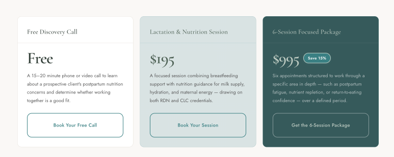
Ultimately we need to communicate how much it costs for someone to get the care they need. The best way to communicate this is to display three offerings: free, single session or a basic package, and a multi-session or premium package. These offers anchor the visitor and lower the barriers inside them. They also see the long term care opportunity from the start, and not simply one session.
7. A booking button wired to a real platform
The problem with contact forms is that by the time you respond the visitor could have forgotten they actually filled it out. A call-to-book button seems like the better option if they happen to catch you when you're able to answer. Voicemail was good enough for the '90s, but the best option is to have the visitor lock in a time on your calendar directly from the web page.
A big, obvious button that opens a real calendar. Not a form. Not "email me." Not "call us during business hours." A calendar the visitor can click and pick a time on, from their phone, at 11pm, in pajamas.
8. Booking and payment policy
Take yourself seriously and your clients will too. Asking for a card on file shows that you bring a level of professionalism to your practice that demands and receives respect.
Your page needs a section (usually under the pricing cards) that explains what happens when someone books, when they pay, what happens if they cancel.
A card holds the appointment. Payment is charged after the session. Cancel more than 24 hours out, no charge. Less than 24 hours or a no-show, the full session runs.
This sets expectations, protects your calendar, and it saves you from the awkward moment where a client has to bring up money in the room. Not having a policy is more awkward than the policy is.
9. Testimonials
Testimonials go without saying. Since one of the biggest tasks for our page is to build trust, this section is bearing witness to your worthiness. But did you know that besides having clients write them you can also have some from your colleagues and even your course instructors.
The hardest part about testimonials is actually getting them. Don't be afraid to ask, and follow up. You can even give people a script or a list of questions to answer.
10. FAQs
The five or six questions you already answer on every discovery call. Every practitioner has them.
Do you take insurance? How is this different from what I've already tried? How long until I see results? What if I miss a session? Do I have to commit to a package?
Two or three sentences each. Every unanswered question on the page is a person clicking off to think about it, and thinking about it usually turns into forgetting about it. FAQs catch the visitors who almost booked.
11. The final CTA
One clear ask, at the bottom, that repeats what you offered above.
Book a free 20-minute call → [button]
Not three options. Not a form with eight fields. Not a newsletter signup dressed up as engagement. The same button, one more time, at the moment the visitor has read the page and is deciding. Give them five options at that point and most pick nothing and close the tab. One door is easier to walk through.
Header and footer — the two pieces people forget
Header. Your name, your specialty in three words, and the same booking button pinned to the top so it's always one click away.
Footer. Contact, address (or service area), booking policy in small print, and any legal you're required to show.
Header and footer aren't the creative part. They're structural. The page runs cleaner when they're settled and left alone.
The whole page, in the mirror
Eleven pieces, plus the header and the footer. That's the whole page.
Most of what a practitioner gets told to add — a blog, a services grid, a philosophy statement, a resources library, a values section, a three-paragraph origin story — is either doing one of these 11 jobs less directly, or it's decoration the visitor bounces off of on the way to booking.
The 11 pieces don't take long to build once the words are ready. What takes the time is #1 (who you help) and #2 (how you help). Those aren't a web design problem, so no amount of hunting for a nicer template makes them come faster. Get those two settled and the rest comes together over a weekend.
Go build it.

How New Clients Actually Find Your Wellness Practice
Ads, referrals, and word-of-mouth are how most wellness practices fill up. Here's how each one actually works, and why they fail
The Lost Booking: Why Ready-to-Buy Clients Leave Your Website (and the Three-Tier Fix)
There's a particular way a ready-to-book visitor leaves your site: they never got to answer "how much, and is it worth it?" Here's the three-tier offer structure that fixes it.
The Decision That Keeps Practitioners From Launching
Choosing a business structure is the step that stops most new practitioners. It's one decision — and a free tool that walks you through it, at your pace.
Ready to go from reading to building?
The Savvy Launch Workshop takes you from idea to a launched practice in one focused half-day — planning, positioning, and momentum included.
See the Workshop